Quick Summary
- Histograms help us visualize distributions. They often unveil valuable insights hidden by the oversimplification of our data.
- Native Qlik Sense histograms really suck are good for simple scenarios.
- For more complex settings, you’ll have to create your own histogram the hard way, using bar or line charts accompanied by the class() and subfield() functions.
About this visualization
Hello everyone and welcome to Data on the Rocks! My name is Julian Villafuerte (a.k.a. QlikFreak) and it’s a great pleasure to be a part of this project. In today’s post, I want to talk about one of my favorite visualizations. Sadly, an underutilized tool in the industry but a very powerful ally for data analysts nonetheless: Histograms.
Despite what a lot of people think, histograms are not bar charts with ugly formats. I mean, that’s kind of true, but there’s much more behind them! While bar charts focus on highlighting the difference in magnitude between multiple elements, histograms show the possible values for a variable and how often they occur. You could say that bars are a great way to present rankings and histograms excel at visualizing distributions.
Better than the average
One thing I’ve learned in my journey as a Qlik consultant is that sometimes numbers can be deceiving. As designers, we usually try to summarize large or complex scenarios into bite-sized pieces that allow us to find insights quickly. However, there’s always a risk of oversimplifying things and not showing the whole story.
But let’s not dwell too much on the theory and jump right into a real-life example. Today we’ll work with a basketball dataset, so bring your old Jordan jersey from 1993 and see if it still fits! (Yeah, yeah… keep blaming COVID for the 3 bags of Doritos you killed last night, fluffy). If you’re not a hardcore NBA fan, there’s no need to worry. We’ll stick with simple metrics and I’ll explain every formula we use.
Let’s say we want to analyze the height of all the players in the league. Chances are that the first thought that crossed your mind was to calculate the average and group it by team, position, or nationality. Some of you might go even further and determine the min and max values in each category to add more context.
 There’s nothing wrong about this approach. Three KPI objects like these can help us summarize our 514-row universe and present it in a glance.
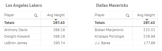
However, overall figures can be a bit cold and often hide interesting details. For example, let’s take two “random” samples for a quick 3-on-3 game between the Lakers and the Mavs. Both groups have the exact same average height but, can you spot anything particular?
 [ This is a “Dora the Explorer” moment. I’ll wait an uncomfortably large amount of time staring at you until I hear the correct answer. ]

[ Still waiting… ] That’s right! In this scenario, the Lakers have very consistent heights. Superman and The Brow are both 2.08 m tall and King James is only 2.54 cm shorter. On the other hand, Dallas has a very odd mix with two of the tallest players in the NBA (Bobi and The Unicorn with 2.23 and 2.20 m respectively) and one of the shortest ones (J.J. Barea with only 1.77 m).
 As you can see, focusing only on summarized metrics can occasionally make you miss hidden patterns in your data. However, it would be impossible for us to check every single row in our data model like we just did with these small samples. Thus, instead of merging the height of all the active players into a single KPI object, why don’t we try to visualize it using a histogram? (You can download the QVF here).
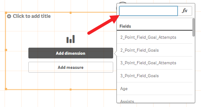
 Building this chart in Qlik Sense is super simple: just drag and drop the histogram object and add the metric you want to display. The interesting part comes later, in the interpretation phase, so let me give you some quick pointers.
For starters, the horizontal axis represents the players’ height. Hence, individuals located in the left-hand side of the chart are considered “short” (speaking in NBA terms, of course). Accordingly, guys in the right-hand side are really, really tall.
 How tall, you ask? Well… THIS tall:
[ That’s Anthony freakin’ Davis (2.08 m / 6’10”) looking like a 5-year-old 🤣 ]
All our data is arranged in several bars called bins. Their size (represented in the vertical axis) is determined by the frequency in which they occur. For example, the seventh group in our chart contains 47 players between 190 and 192.5 cm tall.

Generally, the tallest part of the histogram is in the middle. These high-frequency bins tend to be very close to the average. As you advance towards the edges, the frequency will diminish gradually. Eventually, you’ll reach the “tails”, which contain very rare observations (either too small or too big).
 Some of you probably noticed that the chart adopted a very particular shape. To be more specific, a bell shape that make people shiver in remembrance of their statistics classes in high school. Does σ or μ sound familiar? 😨
But there’s no need to panic. The only Greek symbol we’ll talk about today is this one:
 [ Get it? Greek symbol → Greek Freak → Giannis Antetokounmpo? No? Anyone? 😔 Come on, that was a great joke… ]
Even if we don’t fully understand the theory behind it, a simple visual interpretation of the histogram can guide your efforts in the right direction. The key lies in the shape and the position of the curve. Think about it: if we’re dealing with a compact graph, it means that our population is consistent (most of the values are close to each other). Conversely, if the curve is super wide, it implies high dispersion, which means we have a little bit of everything. You can also find special shapes like these:
 Pretty neat, right?
Histograms in Qlik Sense
I was extremely excited when I saw that histograms were added as a native chart in Qlik Sense a few years ago. Unfortunately, it was a bit of a disappointment. Even though these objects are great for simple data models, there are tons of scenarios where they’ll fall short:
- Multiple fact tables
- Whenever you need set analysis
- The metric is not a given field, but a calculation
- Handling outliers
In the end, it’s still very likely that you’ll need to create an artisanal, old-fashioned, QlikView-style histogram most of the times. I guess classics never get old! 😋
Analyzing Field Goal Percentage (Step by step)
For those of you who are not familiar with this term, the Field Goal Percentage (or FG% for short), is a ratio of the number of shots that a player attempts versus how many of them actually go in. Simply put, if I shot 10 times in a game and I only made 6 baskets, my FG% would be .60.
Field Goal Percentage (FG%) = Field Goals Made (FG) / Field Goals Attempted (FGA)
First, let’s get familiarized with our dataset (remember you can download the QVD and the QVF from our GitHub repository).
 It’s important to notice that we can’t pre-calculate this metric in the script. Since we’re dealing with a ratio and we definitely don’t want to fall in the average of averages trap, we’ll do it directly in the front-end.
1. Create a bar or line chart. Both will work fine in this example.
2. Instead of using a standard dimension, we will calculate it on the fly.
 3. Let’s combine the aggr() and the class() functions to create all our bins.
 Here’s how I would interpret the whole formula:
For each player in our selection…

…calculate the field goal percentage….

…and group it in bins with a width of 2.5%.

4. For the measure, we just need to count the players:
![]()
By now, your chart should look like this:
 The base functionality is ready, so now let’s improve the formatting a little bit. In order to make the x-axis looks cleaner, we’ll only keep the lower limit of each bin.
5. Modify the dimension using the subfield() and num() functions.

Essentially, we’re telling Qlik to do this:
Divide the whole string using “space” as the separator. Keep only the first chunk.

…and format it as a one decimal percentage.

6. Finally, apply a little makeup (titles, labels, colors, and so on). If necessary, go to X-axis > Number of axis values to make sure that all the columns in your charts are shown.
7. Voilà! Now you have a classic, highly customizable histogram. Congratulations!

Possible improvements
- Use an input box so the user can modify the size of the bins with a variable.
- Add more information to the tooltips.
- Group the smallest values in the first bar. We don’t want kilometric tails that affect the aesthetics of the chart. Same goes to the largest values.
- Use Alternate States or Set Analysis to compare different groups.
- Try using a line chart to change to look and feel of the visualization.
At the buzzer
Before we wrap up, here’s one last example I wanted to share! I tweaked the histogram we just created so it could compare the FG% of two positions: PG and PF.
 Even though the game has changed a lot in the last few years, Point Guards (PG) are traditionally short players who are good at passing and dribbling. Think about Steve Nash, Jason Kidd, or Magic Johnson. On the other hand, Power Forwards (PF) tend to be tall players who move well near the paint like Dirk Nowitzki, Kevin Garnett, or Karl Malone.
What can we get out of this visualization? Well, I see 2 interesting things:
- The red curve is located a bit further to the right. This means that, in general, power forwards have a higher FG%.
- The blue curve is more compact, which implies that point guards are more consistent in their shooting percentages (although they tend to be a bit lower).
If you’re a sports fan like me, I’m sure you’ll have a ton of new questions: What about the rest of the positions? Has this changed over the years? What if we compared different teams instead of positions? Is the FG% really related to wins?
Sometimes you can tell that a visualization is useful not because it gives you answers, but because it leads you to better questions. And believe me, histograms always bring more questions.
Final thoughts
So, what do you think about histograms now? They’re pretty cool, right? If you have any feedback or you want to talk more about data visualization (or basketball), be sure to leave a comment in the section below.
Thanks for reading. Until next time!
very nice article. thanks for sharing