In this 3nd part, I introduce more code on how to import World Map KML files and project them to a 3D Globe, by adding a Area Layer on the map Object. in 3D.
It is finally time to talk about the Area Layer!
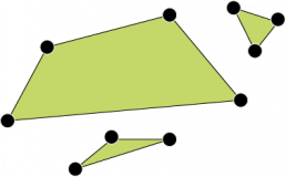
The area layer of the map object is used to display areas, formed by at least 3 points, forming one or several polygons. Yes, one area can be a set of several polygons!
Here is an example of two areas of different complexity:

An area is always “selectable“, so in this picture above, you can make two selections, and in this example below, since this is one area that holds three polygons, you can only select all of them at once.

An area in the map object is described as a series of points in [lat,long] format like this:
An area with one polygon:
[ [10,10] , [20,10] , [10,20] ]
An area with two polygons:
[ [ [10,10] , [20,10] , [10,20] ] , [ [100,100] , [100,200] , [100,300] , [100,400] , [400,100] ] ]
A popular format for saving/loading country data coordinates is “KML files”.(KML = Keyhole Markup Language, a kind of XML format for geographic annotation)
If you open a KML file you will see this kind of data structure, and there is a standard way of importing KML files into Qlik!
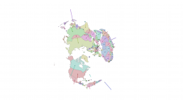
Showing Country Areas in 3D
There are already many guides on how to load “country border data” into Qlik Sense and display it on the map object so I will not spend much time on this. Instead I will look more closely on how the area data in the KML file is constructed since we need to recalculate that data down to its smallest particles (the lat & long parts).
Here is a simple script to load data from a KML file:
Countries:
LOAD
  recno() as UniqueId,
  "World Map.Name" as Country,
  "World Map.Area" as AreaLocation
FROM [lib://Data/World Map.kml]
(kml, Table is [World Map/]);
Please see the link to the data source at the end of this article.
If we look at the field AreaLocation for one country, it looks as below:
[[[[22.183173,65.723741],[21.213517,65.026005],[21.369631,64.413588],[19.778876,63.609554],[17.847779,62.7494],[17.119555,61.341166],[17.831346,60.636583],[18.787722,60.081914],[17.869225,58.953766],[16.829185,58.719827],[16.44771,57.041118],[15.879786,56.104302],[14.666681,56.200885],[14.100721,55.407781],[12.942911,55.361737],[12.625101,56.30708],[11.787942,57.441817],[11.027369,58.856149],[11.468272,59.432393],[12.300366,60.117933],[12.631147,61.293572],[11.992064,61.800362],[11.930569,63.128318],[12.579935,64.066219],[13.571916,64.049114],[13.919905,64.445421],[13.55569,64.787028],[15.108411,66.193867],[16.108712,67.302456],[16.768879,68.013937],[17.729182,68.010552],[17.993868,68.567391],[19.87856,68.407194],[20.025269,69.065139],[20.645593,69.106247],[21.978535,68.616846],[23.539473,67.936009],[23.56588,66.396051],[23.903379,66.006927],[22.183173,65.723741]]],[[[17.061767,57.385783],[17.210083,57.326521],[16.430053,56.179196],[16.364135,56.556455],[17.061767,57.385783]]],[[[19.35791,57.958588],[18.8031,57.651279],[18.825073,57.444949],[18.995361,57.441993],[18.951416,57.370976],[18.693237,57.305756],[18.709716,57.204734],[18.462524,57.127295],[18.319702,56.926992],[18.105468,56.891003],[18.187866,57.109402],[18.072509,57.267163],[18.154907,57.394664],[18.094482,57.545312],[18.660278,57.929434],[19.039306,57.941098],[19.105224,57.993543],[19.374389,57.996454],[19.35791,57.958588]]],[[[20.846557,63.82371],[21.066284,63.829768],[20.9729,63.71567],[20.824584,63.579121],[20.695495,63.59134],[20.819091,63.714454],[20.799865,63.780059],[20.846557,63.82371]]]]
And you see it has the structure I mention above.
If we look at Indonesia, which is a country with many islands, in theory the area code would be like this:
[ Indonesia ] = [ [Java] , [Bali] , … ]
And each Island is a set of coordinates:
[ Indonesia ] = [ [Java] , [Bali] , … ] = [ [ [lat1,long1] , [lat2,long2] , [lat3,long3] , [….] ] , [ …] ]
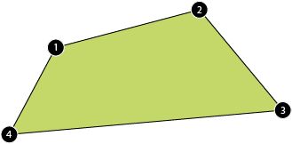
When looking at this data it is very important to keep the order of the coordinates, because we draw lines from one point to the next. Look at the picture below. The points are are located in the same place, but the two figures / areas are different, because the order of the points are different.


Our goal is now is to find all latitude and longitude values that belongs to each other (forming one single area), keeping the original order of all points, and then translate those points to x,y and z coordinates.
Our data looks like below:
We want to identify all latitude and longitudes on each “area” in those areas, convert all of them to x, y and z. We goup alll location with a unique AreaKey and the transformed data should look like this (where the order of the rows are important):
Take a deep breath, as I will do this using native Qlik Script, it will be some weird combinations of functions. It could have been done more easily using regular expressions like in this article written by Terezia. And perhaps there are even better ways?
Anyway, subfield is a very useful function to split long strings up in smaller parts.
The line
subfield("World Map.Area",'[')
will split up the long string for every occurrence of a [ which is a great start!
Using subfield together with replace to remove the ], and using preceding loads with some peek to group the areas properly, we transform this long strings into X, Y, Z coordinates with this code:
temp:
Load
  CountryID,
  Country,
  LongLat,
  rowno() as RowId,
  if(CountryID<>peek(CountryID),0,
    if((peek(LongLat)='' and LongLat<>'') or
       (peek(LongLat)<>'' and LongLat=''),
          peek(Group)+1,peek(Group))) as Group,
  subfield(LongLat,',',2) as lat,
  subfield(LongLat,',',1) as lng
  ;

LOAD
  recno() as CountryID,
  "World Map.Name" as Country,
  replace(
    subfield("World Map.Area",'[')
    ,']','') as LongLat

FROM [lib://Data/World Map.kml]
(kml, Table is [World Map/])
Some explanations of the script above:
- Field Group : This is the tricky part. We have to identify when coordinates from one area start and when it stops, and then make a field that groups them together. I’m sure there are more ways to do this.
- Field RowId : We need this field (for later) because the order of the coordinates is important. Imagine you have 4 points on a surface, and the task is to draw lines between the points so that it makes them into the shape of a rectangle. It is important to choose the right point in the right order, because there are many ways to draw the lines into something that is not a rectangle.
After this we just apply the same functions on the lat, lng fields (same method we did in our Point Layer):
Data:
NoConcatenate
Load
  *,
  if(z<0,'Hide','Show') as ShowStatus
  ;
Load
  *,
  Country&Group as AreaKey,
  $(x_latlong(lat,lng)) as x,
  $(y_latlong(lat,lng)) as y,
  $(z_latlong(lat))     as z
resident temp
where lat<>'' and not IsNull(lat);
drop table temp;
Some explanations of the script:
- Field ShowStatus : This new field makes it possible for us to show/hide what is on the backside of the earth. When z<0, it means, it is beyond the “horizon”. It’s not going to be perfectly solution but it is “good enough” for now. Alternatively, you can just remove all the points with z<0 as they are behind the Earth horizon and should not be seen.
- Field AreaKey : This is a unique key for each area of each country. Some countries may just have one area, but countries with combination of the areas, perhaps by many islands, will have multiple keys. This is the field we will use as Dimension in the Area Layer.
- …where lat<>” and not IsNull(lat) : Here we are just removing blank locations.
Please see the link to the data source at the end of this article.
Reload – and we are done with the script!
-> We continue with the interface!
Like before, create a new map object with the same setup.
Add a new area layer, and select AreaKey as dimension and add this expression in the location field:
'[' &
       Concat(
          GeoMakePoint($(yz2y(y,z)),$(xz2x(x,z)))
          ,','
          ,RowId
       )
       & ']'
This expression generates new lat/long coordinates, in the same order (because of RowId) as in the original data source, but transformed into our 3D world. (So, a rectangle stay in the shape of a rectangle)
Continue to the Colour tab, and select perhaps colour by dimension Country.
Your map object should look like this:
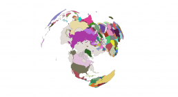
It looks a bit weird? It is because we are looking at the globe from the complete north, and since our globe is “transparent” we also see the Antarctica but “from below”.
So for now, the easiest way to get rid of the “Antarctica-problem”, is to exclude the whole continent in the load script.
A perhaps more interesting way to deal with it is to look at the z-values, because when the z value is below zero, it means that this point should be hidden / (not rendered).
How to rotate the earth to how we normally look at it, stay tunes for next article.
But just to round things up for now, we can now combine the three layers (points, lines and areas) into one visualization.
The end result can look like this:
To get to that result, we need to have one data point for each country. We could join in the capitals for each country, but I will try to keep things simple and just use the data we have.
There is a neat Geo function in Qlik called GeoGetPolygonCenter that has the purpose to find the middle of any polygon. It’s perfect for our visualization because, once we have the middle of a country, it could be the starting point for our vertical line.
So I add these two lines to the code where we load data from the KML file:
temp:
...
len("World Map.Area")/2 as CountryLineLength,
keepchar(GeoGetPolygonCenter("World Map.Area"),'-01234567890,.') as CountryMiddle,
...
The field CountryLineLength is just a dummy figure, it will be the line length, it should be something relevant but this KML file didn’t have anything of value.
GeoGetPolygonCenter generates a point with brackets, so keepchar(…) is a way to remove them.
Then we add these lines in the last load
Data:
...
$(x_latlong(CountryMiddle_lat,CountryMiddle_lng)) as middle_x,
$(y_latlong(CountryMiddle_lat,CountryMiddle_lng)) as middle_y,
$(z_latlong(CountryMiddle_lat))                   as middle_z
...
And reload.
Now we have the possibility to add a Point layer, and a Line layer just like we did before. Use Country as dimension for both Point and Line layer. We just want one line per Country.
Use this expression for the Point layer (and start point of Line layer):
GeoMakePoint($(yz2y(middle_y,middle_z)),$(xz2x(middle_x,middle_z)))
And this for the Line layer “To”:
GeoMakePoint($(yz2y(middle_y,middle_z-CountryLineLength)),$(xz2x(middle_x,middle_z-CountryLineLength)))
Some final words and next steps.
Much more can be done to make this visualisation beautiful. The Z value is a key value for colouring/shading the globe and it can be used make the shade darker as further away the object is.
Using set analysis, in particular {1} makes things more appealing when you click on a country in the globe, as the unselected countries will still be visible but greyed out. Also using set analysis to only show things that should be visible <ShowStatus={Show}> could be a good idea.
Thanks for reading.


Article Resources
Try the app live here
If you are interested in downloading the example app, you can get it from our GitHub here:
- Map object go 3d (part 3) (And data source here)