Want to rank things over time?
This post will help you to understand how you can use a bump chart to do just that.
Quick Summary
- Every now and then you might want to visualize ranking based on a specific metric for a given dimension. A data visualization alternative you can use to do this is called a ‘bump chart’.
- Somewhere on the internet I have posted a similar chart in Qlikview long time ago. This Sense version is meant to also update that post.
- This article will show you how this visualization is created and what data it requires to work properly. At the end you will be able to download an app with the examples shown.
Requirements
- Metrics: 1
- Dimensions: 2
- Chart Type: Line chart
- Data used: https://github.com/qlik-blog/data-models/tree/master/bike-sales
More information on how to use line charts in Qlik can be found here.
Example Visualization
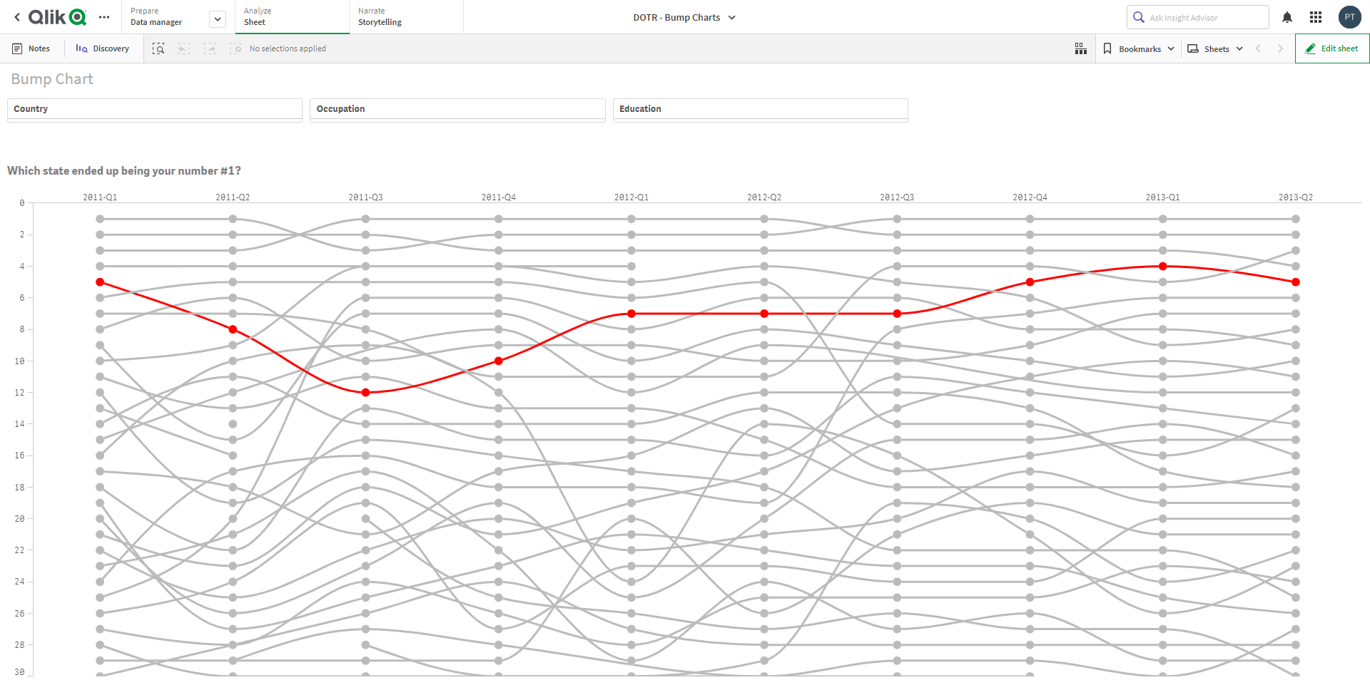
In the example chart above you can see how this visualization works. Every line represents the change in rank for a ‘state’ of a country where we are selling products. Visualizing data like this will help us to identify how states change in for example a top-n analysis. This will also help us to get an idea of decline or growth within certain countries and states.
The red line in the chart represents the state of ‘Victoria’. You can see in the 1st quarter of 2011 Victoria ranks 5th. Following this line over time you can see all the ranks Victoria ended up in a specific quarter.
Chart Creation
Maybe you would want to create a chart like this yourself. Here is how you can do this:
- Add a line chart onto your canvas
- Add the following properties in the settings of the chart:
- Use the field ‘YearQtr’ as the group dimension (Exclude null values)
- Use the field ‘State’ as the line dimension
- For the ranking use the expression further below
- The expression format pattern should be set as ‘0;0’
Expression to be used:
rank( sum( {<YearQtr -={'2013-Q3'} >} SalesAmount), 4 ) * (-1)
In the above expression we are excluding 2013-Q3 because this quarter isn’t fully completed in the data. So it is done for cosmetic reasons 🙂

Next thing to do is set some styling properties to design the chart as in the example visualization.
- Under presentation set the following items:
- Choose ‘line chart’
- Set ‘Horizontal’ mode
- Set scrollbar to ‘None’
- Set missing values as ‘Show as connections’
- Check the box for ‘Show data points’
- Set grid line spacing to ‘No lines’
- Under Styling set the following:
- Choose your own preferences for ‘Data point size’ and ‘Line thickness’
- Set line curve to ‘Monotone’
- Under ‘Colors and legend’ set the following:
- The last things that need to be set are axis settings:
- X-Axis: Set labels and titles to ‘None’
- Y-Axis: Set labels and titles to ‘Labels only’

After performing all the steps described above, you’ll end up with your own version of a bump chart. Nice!
Article Resources
Some of you might also only be interested in the example data and app that come with this article.
Here are some links for you to grab what you need:
If you have any questions or ideas, please feel free to use the comments or reach out to one of us!