Driver analysis quickly tells users how fields and field values are related to a metric, comparing many slices of data at the same time and serving up prioritized potential insights. You may even discover that some commonly used fields are not predictive at all and can be removed to reduce noise in an application.
Customer churn is the classic use case, in which a company would like to know which customer characteristics are most associated with them cancelling (or not cancelling) service. I found sample data here.
In our example, Churn % is defined as Customers who churn (Churn = ‘Yes’) / All Customers. We will evaluate each dimensional field value’s influence by comparing its Churn % to the rest of the population, excluding that slice of customers.
Here is the completed output:
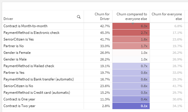
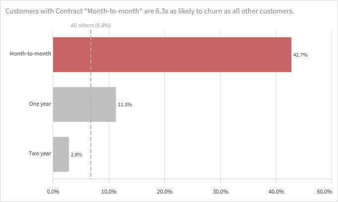
In plain English, the first row of this table should be interpreted as: Customers with a month-to-month contract are 6.3x as likely to churn as those with other contract types (one year, two year). 6.3 is derived by dividing the churn for Month-to-month (42.7%) by the churn for all customers who are NOT Month-to-month (6.8%).
This calculation is different than just comparing to the overall population Churn % (26.5% in this sample data) as a baseline. Note that the second row in the screenshot actually has a higher Churn % than the first row, but is not as noteworthy in terms of diverging from the Churn % for the rest of the population, excluding itself. Why it this nuance important? If one slice of data makes up the majority of a category — ex., if nearly all customers have just one line — comparing the churn for customers with one line to the overall average churn is unlikely to reveal anything because they’ll be so similar. But by comparing to the population excluding customers with one line, we are more effectively isolating the variable or driver.
There are two main challenges in building this solution:
- Comparing many fields at the same time without having to cycle through them — accomplished through the data model
- Comparing a population’s churn to the churn for the population excluding itself, not just the overall average — accomplished through an expression
Let’s get into how.
The data model and script

Comparing values from many fields at once without having to independently cycle through them requires some additional data modeling. To solve this problem, I used a generic key. Generic keys can be a difficult data modeling concept to grasp, and I recommend reading this classic HIC post for more background.
Fortunately, while the generic key concept can be complicated, the recipe to build this data model is simple:
- Create a concatenated key in the CustomerChurn table with all dimensional fields you want to analyze. We called ours _KeyDriverAnalysis.
- Create a new table doing a distinct CrossTable load of that key followed by all of its components.

…

Notice how the CrossTable load “unpivots” each row into multiple rows in the new table — one for each component of the concatenated key.

The fields in the new table now contain generic field name/field value pairs.
I call this a “recipe” because any list of fields can be substituted, and the resulting data model will not change. Neither will the expressions in the next section.
The expressions
The general Churn % expression in our table is simple:
Count({<Churn = {'Yes'}>} customerID) / Count(customerID)
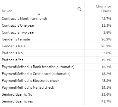
This output leveraging the generic key is already interesting — you can see which slices of data have the highest and lowest churn across many fields, at the same time, in one table. Cool.
However, our goal is to compare the Churn % for each slice to the total Churn % for the population excluding itself, which is more complicated. How can we calculate the churn for everyone else? I recommend using math.
Here is the formula in plain English…
(Count of all customers who churned – Count of all customers with this property who churned)
/
(Count of all customers – Count of all customers with this property)
…and the translation to a Qlik expression. To try to understand it better, you may want to enter the four parts individually as expressions and observe the results.
(Count(TOTAL {<Churn = {'Yes'}>} customerID) - Count({<Churn = {'Yes'}>} customerID))
/
(Count(TOTAL customerID) - Count(customerID))
To enable users to filter Driver and Driver Category values without affecting the results, more Set Analysis to the TOTAL aggregations is needed.
(Count(TOTAL {<Churn = {'Yes'}, Driver = , [Driver Category] = >} customerID) - Count({<Churn = {'Yes'}>} customerID))
/
(Count(TOTAL {<Driver = , [Driver Category] = >} customerID) - Count(customerID))
Yes, these are a bit complicated, but they will never need to be revisited, even if the fields included in the analysis change.
Once we have these components (the first and third measures in the complete solution screenshot), it’s just a matter of dividing Churn % by Churn for all others in category, using the expression labels.
[Churn for Driver] / [Churn for everyone else]
Some fancy number formatting can be used to add an x at the end of each value to signify that the numbers are multiples: #,##0.0x
This is a relatively simple example, but the insights may be beyond what many users will find in basic aggregate analysis. The complete solution is linked here: Driver Analysis.qvf
Thank you
Thank you for this recipe
Hi Michael – Thanks for the fantastic guide! What an elegant solution to leverage a generic key for tying all the individual drivers back to the main table. The rest is history.
I am now thinking about a data model that would store all possible pairs of driver fields to enable second-order analysis (e.g. Where Contract is One Year AND Gender is Male, Churn is 3x higher than the rest of the population).
Any thoughts on implementing this on top of your script logic?