Recently we at Axis had an internal discussion about a request to sort the segments in a stacked bar chart so each stack’s segments were always ordered from the largest segment on top to the smallest segment on the bottom.
I have never cared for stacked bar charts as you have to look across and try to determine across the stacks which ones grow or shrink over time.
The request reminds me a bit of a line rank visualization (AKA bump chart) if you are familiar with those. These are more legible for seeing pure rankings, but don’t visualize the magnitude of the measure being ranked.

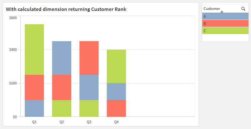
The default Qlik sorting behavior applies only one chart-level sort to each dimension, regardless of other dimensions in the chart. In this dummy data, sorting the Customers in descending order by Amount will determine a ranking based on total Amounts, with the same ranking repeated in each bar.

Instead of grouping by Customer in the chart, which would be the logical choice, I found the solution to the problem was to instead group by the Rank of the Quarterly Amount for each Customer. These ranks will naturally sort 1, 2, 3, …, with a consistent domain of values for every Quarter, even though the amounts being ranked and the order of customers changes. As usual, I prototyped in a table so I could check my work as I went.

Aggr(Rank(Sum(Amount)), Quarter, Customer)
Because it’s a calculated dimension across which chart measures will group, the chart measures become quite simple to calculate, ex., Sum(Amount) to get the the lengths of the bars. The calculated dimension does all of the heavy lifting.
Following are some additional implementation details, contextualizing the expressions in this screenshot:

The rank is great, but how do we know the Customer with that rank?
Thanks to the calculated dimension, Only(Customer) returns the Customer name for a given slice. To make this display in the hover text, I added the expression as a tooltip in the final chart.
Only(Customer)
How will the colors work? The goal is to visually track the same slice of data across each stack of bars.
The Customer with the rank of 1 may not be the same in one Quarter as the next, so we’ll need to make the colors dynamic. My quick and dirty solution to this, which can be used to make the values consistent with other charts, is to use FieldIndex() to determine which position in the load order the Customer name is, then plug that number into the Color() function. You can use a similar approach to create a separate legend object, which will stay in sync with the colors of the chart.
Color(FieldIndex('Customer', Only([Customer])))

Note that if you have specific colors in mind for the slices, I recommend storing them directly in the data model, ex., using the RGB() function to assign specific colors to specific dimensional values. Then you can return the result in a color expression using the same approach as the Customer name: Only([_Customer Color]).
What if there is a tie between two Customers within a quarter?
I guess you could call this a known limitation, but I am arbitrarily assigning different ranks in the event of a tie through the optional second parameter of the Rank() function. Visually I figured that was better than any alternatives I considered. I built one “tie” into the sample data in Q4 (A and B are both 100) to ensure I had an expression that would work.
Aggr(Rank(Sum(Amount), 4), Quarter, Customer)
Overall, you could use a similar approach in a pivot table to show how dimensional values bounce between rankings over time. In this screenshot, I concatenated both the Customer and Amount in the same cell. Think of this as a cousin of the typical heatmap, in which you might expect to have a fixed row per Customer and dynamic cell background colors to highlight higher or lower values.

See linked example including all of this work: Re-sort stacked bars.qvf