How to introduce app to users
How to keep users focused, part 1
We believe we want self-service. However, with hundreds of apps, millions of data points, almost unlimited design options, and limited time, what we need is GUIDANCE. And with guidance comes FOCUS. In this series of posts, you’ll find all from basic principles up to advanced tips & tricks for developers on how to build applications that keep users on track without any limitation of the self-service capabilities.
INTRODUCTION (from DAR to IDAR)
Scenario: You just finished the application development. It contains more than 3 sheets, their order makes complete sense. John opens the application, reads the names of sheets, and opens the third one. “Why don’t I see these specific values I’m looking for? I’d expected them to be here.” You, a bit disappointed: “It’s a flow of the analysis. You start on the first sheet, make selections there, on the second one you specify what you’re looking for, and on the third sheet you’ll see the values you want.” And you believe he won’t come back with the same question when he opens the app next month.
When working on something we keep focused on the use case, data, context. It’s very hard to imagine how the application will be understood by a user who is a business user (oh yeah, that’s a big rock, too) and who has never seen it before. You can explain it to him/her. However, do you really want to explain it to every single user? Even those who will come in the next years?
TIP 1: Introduction
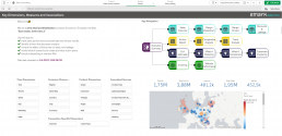
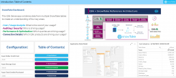
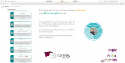
Start the app with an introduction sheet as a standard. It helps users to understand what the application is about, which sheets are included, and if there’s any specific flow of the analysis that is expected.

TIP 2: Design
And when there is a sheet only with an introductory function, use it well. You can use the company’s design manual to show users it’s an application related to your company specifically so they can trust the content. Use the same design within all apps to keep users comfortable when using different applications. After a while, they might read the intro sheet first before they ask you questions 😉.
TIP 3: Video
If you think it’s much better to explain the app on the step-by-step video, do it! In the newer version of Qlik Sense, you can find a Video player extension in the Qlik Dashboard Bundle. It allows you to embed a YT video directly on the sheet. If you have an older version of Qlik, there is a free extension you can download – YouTube Player by Joe Warbington.
TIP 4: Images/GIFs
If the text is not enough and the video too much, combine the text with images. And within the Qlik Text7image object, the GIFs are supported, too!

TIP 5: Interactivity
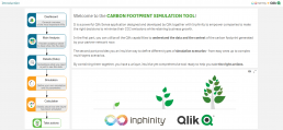
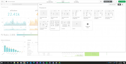
Make it a bit interactive to keep users engaged. You can start with a personalized welcome message by using osuser() function. If there are any selections/choices valid for the whole app, have them here with the possibility to change them on all the sheets. It can be the currency, year, department, and much more.

TIP 6: Navigation
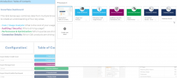
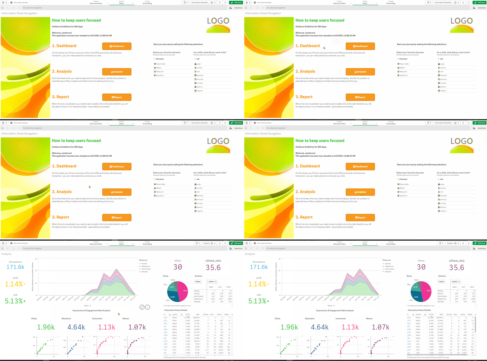
As Qlik native navigation panel is smaller and smaller, teach your users to use the Intro sheet to navigate through the app. They’ll always find here the content of the app and can be redirected to specific sheets. For this purpose, you can use Qlik button or one of the available extensions.
TIP 7: Storytelling
Even before a user is redirected to a specific sheet, by using Inphinity Flow extension, you can show him/her the most important KPIs, charts, information. It’s up to users then, whether they want to be redirected to a sheet with detailed information.

TIP 8: Collect the feedback
No user will understand and like the app as the developer. However, it’s for them. So, let users share their feedback about the app by using one of the available write-back extensions, e.g. Inphinity Forms, Qommentary, Vizlib Collaboration, Write!, and others.

TIP 9: Creativity
Be creative, check the capabilities of available extensions, and develop whatever makes sense for your users and use case. Visualize the app engagement, rate the app, upload the documentation, add a button to contact a support team via e-mail, or anything else you want 😊.

Inspiration
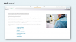
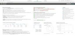
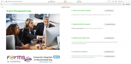
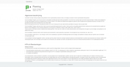
Here are some real-life examples from all over the world and industries. You might not like all of them but that’s exactly the point – to find the best fit 😉.
Thanks for sharing screenshots and/or thoughts: Dalton Ruer, Robert Svebeck, Radovan Oresky, Alberto Varela, Jaime Saldana, Alexander Nagler, Yorick Esser, Ingo Hardieck.
I hope you find this post useful or at least it makes you think about how to make users’ life easier and engage them 😉. Any feedback, thoughts, other ideas are very welcome!
