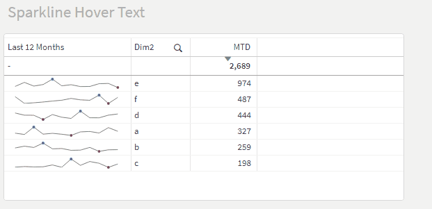
Limitation of default sparkline behavior
“All data points in the sparkline show the same value when I hover, and it seems to be the wrong value.”
The first time I used a sparkline in a Qlik Sense table, a reviewer thought it was broken. In fact, it was working as designed, but I had a hunch I could do better for my customers.
The default hover behavior in sparklines is displaying the overall metric value, disregarding the time period dimension that splits the measure out into a trend of data points. For example, hovering over a scheduled hours sparkline with 40 hours per week for six weeks raises a “240” popup (40 * 6).
That could be helpful if you understand what the “240” means, but improving clarity and preempting questions is always preferable to viewing things as training issues.
Note: Sparklines are meant to contextualize a measure with trend data in a very small area, not convey precise amounts. So I do understand the design decision, although the popup is confusing.
Building out a custom hover text solution
Simplify the next steps with Master Measures
Before we continue, let’s store our base measure expression in a Master Measure to simplify writing formulas later. (Using a variable would also work.) In this case, I wrote a formula for the trailing 12 months, saved as a Master Measure called Last 12 Months, i.e., the 12-month period ending last month.
Sum({<MonthIndex = {">=$(=Max(MonthIndex)-12)<$(=Max(MonthIndex))"}>} Expression1)
Remember that you can now refer to Master Measures by name in your formulas. We’ll use that a lot.
Using Dual to customize hover text
My first test was to figure out whether the hover text for a Dual value behind a sparkline would display the text or numeric value.
Dual('Is this hover text?', [Last 12 Months])

Note: The Dual text displays only if the number formatting is set to Auto. Otherwise, the hover text will display the number, using the format you have set.
Nice. Now that I had proven the text component of a Dual value can be displayed on hover, solving the ambiguous hover text problem boiled down to creating a formula that returns helpful, user-friendly text in the first parameter of this function.
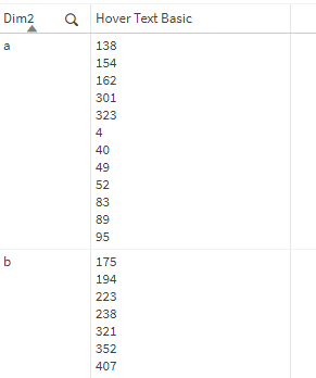
Putting all data points in a single value
Let’s clarify the target we’re after here: there is only one possible hover value per table row/sparkline. (See the gif at the top.) You can’t enable individual hover text per point on each sparkline. We must come up with a single text value that includes all 12 points on each sparkline.
Enter the infamous Aggr function: by aggregating at a level including the month and the table dimensions — just like the sparkline data points — we can generate an array of monthly data points for each row in the table.
Remember: Aggr returns a dimension. We need an aggregation function to summarize that array of values into a single value per row of our table. I wrapped the Concat function around the Aggr results to roll up the 12 data points, delimited by carriage returns, Chr(10).
Concat(
Aggr(
[Last 12 Months]
, [Dim2], [Month])
, Chr(10))
For debugging, we can write this formula as its own Measure expression and see exactly what it returns, then work it back into our full sparkline solution.
Iterating on the results to a final expression
Okay, that got us closer, but I think it would help to see the month names next to the values, right?
Concat(
Aggr(
Month & ': ' & [Last 12 Months]
, [Dim2], [Month])
, Chr(10))

Ah, this highlights a few new problems/opportunities:
- Months are listed alphabetically. We can solve this using the optional third parameter for the Concat function: the sort weight. The Month field (or MonthIndex) will sort the data points chronologically.
- The measure numbers have no formatting. That is a quick fix using the Num function on [Last 12 Months].
- All months in the calendar table are listed, even if they are outside the 12-month range computed in our Master Measure. There are a few ways to approach this, but the simplest is to reuse the Set Analysis defining the time period from the Master Measure in the Concat function, too.
Concat({<MonthIndex = {">=$(=Max(MonthIndex)-12)<$(=Max(MonthIndex))"}>}
Aggr(
Month & ': ' & Num([Last 12 Months], '#,##0')
, [Dim2], [Month])
, Chr(10)
, Month)

Now our text is looking good. If a user hovered over a sparkline and saw this, it would be helpful, not confusing. So let’s add it back to our Dual function as the text parameter to see the whole solution.
Dual(
Concat({<MonthIndex = {">=$(=Max(MonthIndex)-12)<$(=Max(MonthIndex))"}>}
Aggr(
Month & ': ' & Num([Last 12 Months], '#,##0')
, [Dim2], [Month])
, Chr(10)
, Month)
, [Last 12 Months])

Perfect. The formula looks messy, but we just replaced the bold text below in one of the first expressions we wrote with the final hover text formula we prototyped in its own measure.
Dual('Is this hover text?', [Last 12 Months])
Extending the concept behind the solution
Using Dual to customize the hover text can also enhance other styles of mini charts.

You could even contextualize the mini chart with supporting metrics that are not visualized. For example, if your sparkline displays variance to budget, you could add the actual and budget to the hover text.
Another creative application of this approach was used by Karl Pover at a recent customer. He added custom hover text to an icon to embed detailed help text relevant to the object. The column with the indicator was shown/hidden with a button (along with other helpful context, like chart subtitles).
Dual('You can put whatever help text you like here', 0)
![]()
To get the above expression to work as pictured, use the following expression settings:
- Representation: Indicator
- Click the colored rectangle to set the indicator icon and color.
- Uncheck Show values
See linked example including all of this work: Custom Sparkline Hover Text.qvf