Lollipop charts can be a great alternative to a bar chart. They are visualizations with a lighter touch than bar charts, but they may be easier to understand than a dot plot. In my last post, we created a dumbbell chart, but some might have noticed that if we cut the dumbbells in half, we can also create a lollipop chart. The measures to do so are simpler, so let’s reduce the dumbbell chart recipe to only what is necessary to create a lollipop chart using an out-of-the-box Qlik Sense object.
Lollipop chart recipe
Let’s make some candy!
- In your Qlik app, start with a combo chart.
- Add a dimension and then 1 measure that you want to analyze.
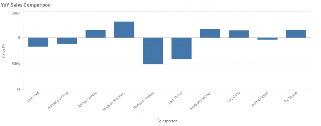
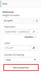
My inner Stephen Few is saying that this bar chart is perfect and that I should stop now, so feel free to take the exit ramp before entering candy land. - Next, go to More properties, and make the measure a Marker. If necessary, customize the shape and color.
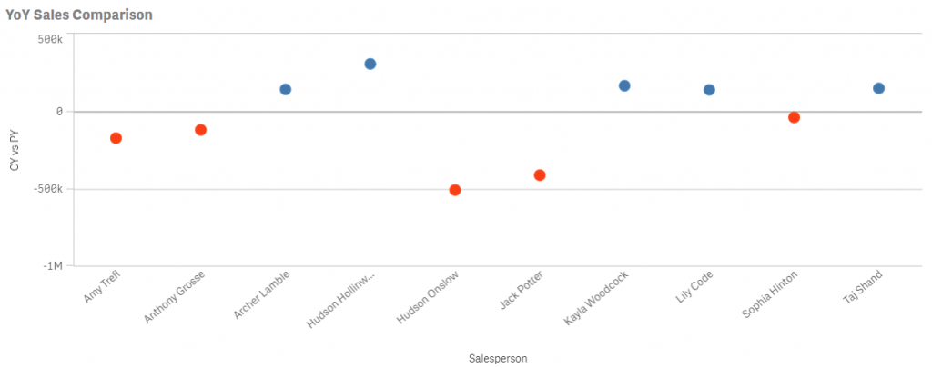
After these changes, your chart should look like the following chart.
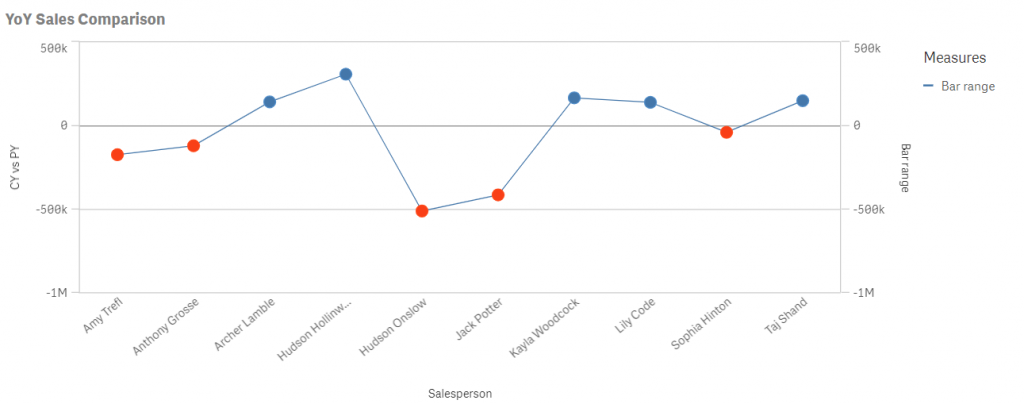
- Now add one additional measure. Define the label to Bar range and define the expression as
Column(1)
This is how your chart should look at this point.
Even though the 2nd measure is the same as the first, beware that it did assign the 2nd one to the secondary axis. We’ll fix that in the next step. - Next, change the properties of Bar range to be bars and assign them to the Primary axis.

Then, define the color for Bar range to be=LightGray()
Your chart should now look like the following.

- The final major step is to change the bar in the Styling button at the top of Presentation, and make the bar width something narrower.
It should now look like a lollipop chart.

What’s Next?
One additional feature that comes to mind is to add a data label to the dots. Although, this isn’t difficult, it’s also not straightforward. It is also useful for more than just the lollipop chart, so let’s cover this in the following post.
Nice touch, Karl. I’ll remember this next time I need to make my data look sweeter 🙂