Breadcrumbs in Qlik
How to keep users focused, part 2
Let’s imagine you should approve bonuses for the top management not knowing how they’re calculated and whether they make sense according to the performance and results. If I should make a decision about the new pricing structure not knowing how the price is calculated, would my decision be at least somewhere about right? It might be, it might be not, or I wouldn’t make the decision at all.

Missing information causes stress and lack of focus… or even worse, ignorance.
Understanding brings CONFIDENCE.
INSIGHTS-DRIVEN DECISIONS
Why not data-driven decisions? Data is raw pieces of information. No context, no understanding. Insight is gained by analyzing data to understand what is going on with a particular situation.
If my boss would make a decision about my future in the company or a bonus, I’d rather be sure (s)he understands my role, responsibilities, and added value than just see my wage. If that’s still a not enough persuasive example, let’s imagine your doctor making a decision whether or not you should be operated on. 😉
So, what can we do to help Qlik users gain insights? Let’s give them breadcrumbs, clear explanations, wherever they might need them. Even one sentence can have a big impact on understanding and focus.
TIP 1: Use titles, subtitles, and footers
Everyone knows it’s an option. But honestly, what do you write in there for end-users? Nothing? Or just saying on this chart there are “orders by a country”?
The first level is to explain where the data comes from or how is it calculated when needed. More advanced is to utilize the option to define title/subtitle/footer by expression providing a context based on the current selections. Bonus tip: use variables to show/hide explanations. 😉
In the example below, when the user wants to see details, (s)he sees the following breadcrumbs:
- What to do to find more data in the pie chart: Hover your mouse over the pie chart…
- The direct context in the bar chart: Year of currently selected data
- The additional context in the bar chart: Currently selected products – that is very helpful especially when selections are made somewhere else on the sheet or on another sheet
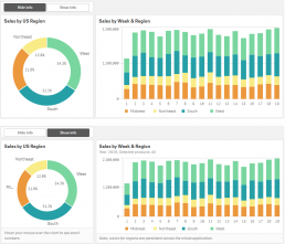
Pie chart footnote:
=if('$(vDetails)'=1,'Hover your mouse over the chart to see exact numbers.','')

Bar chart subtitle:
=if('$(vDetails)'=1,
'Year: ' & concat(distinct [Year Sales], ', ')
& ', Selected products: ' & if(getselectedcount([Product Name]) > 1, 'Multiple', If(getselectedcount([Product Name]) = 0, 'All', getfieldselections([Product Name])))
,'')

Bar chart footnote:
=if('$(vDetails)'=1,
'Note, colors for regions are persistent across the whole application.'
,'')
Note, when you use the variable to manage whether or not the title/subtitle/footnote should be displayed, you need to define ” for ‘not displayed – in my case, the second parameter of the if() statement. Otherwise, – will be shown there. Try it, you’ll understand 😄.
TIP 2: The power of tooltips
Tooltips are very powerful. They’re hidden and when shown, they can contain quite a long explanation with examples, specific data, etc.
To get the most out of them, we need to:
- Use them whenever they’re supported and make sense
- Be sure users know they’re available (see TIP 1 and BONUS TIP)
Multiple Qlik objects offer quite extensive options when it comes to the tooltip, e.g. include a master visualization or image.
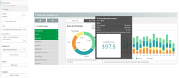
Description:
='Year: ' & concat(distinct [Year Sales], ', ')
Measure:
=If(getselectedcount([Product Name]) = 0, 'All', concat(distinct [Product Name],', '))
If you use extensions, explore their properties panel – at least the option to show an explanatory text is often available in them, too.
TIP 3: One sheet full of the context
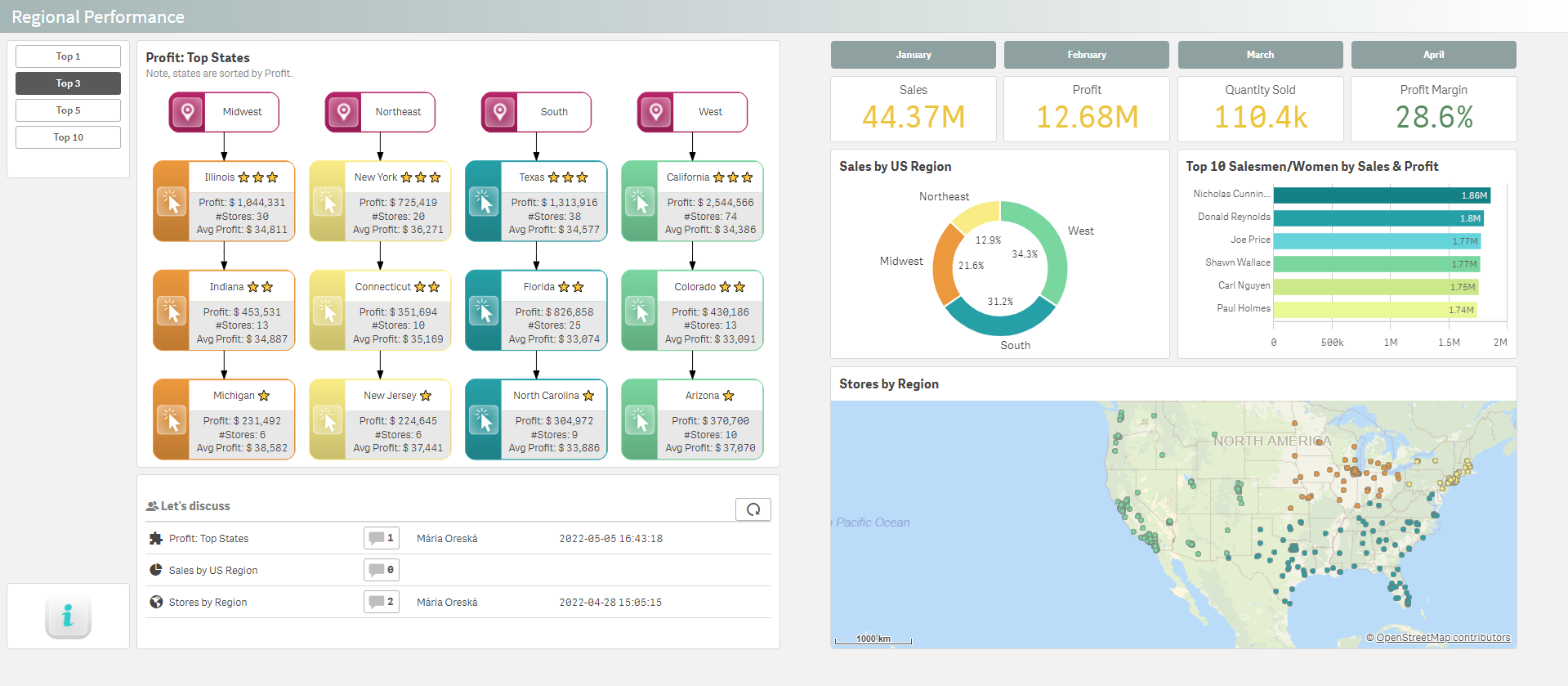
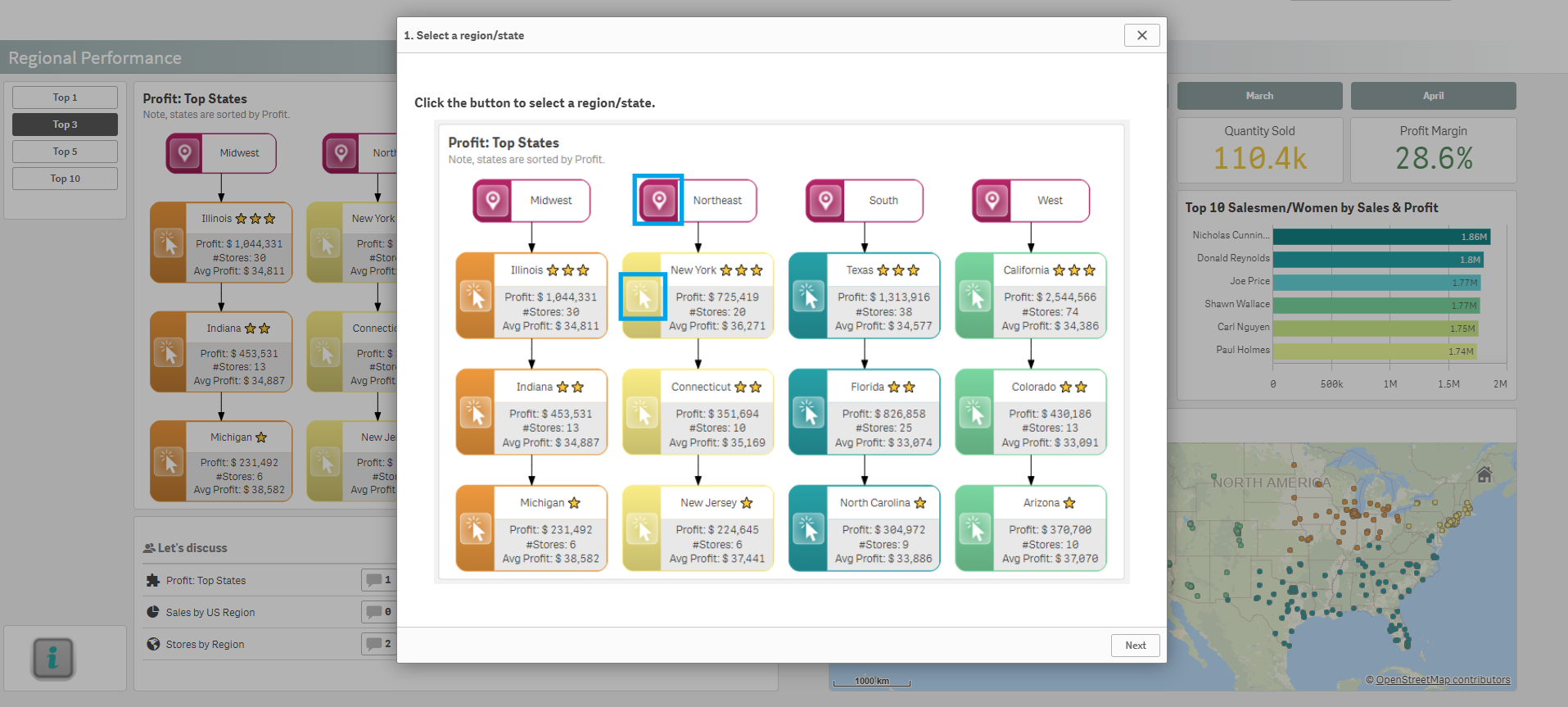
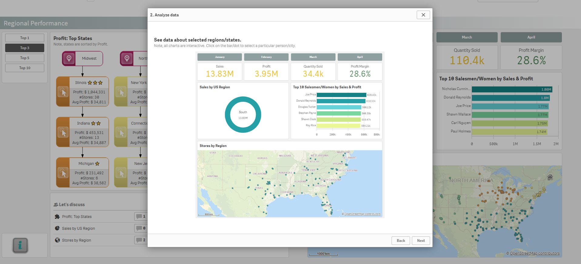
When the explanation is longer, e.g. when it’s a complex process that needs to be explained, or you want to include a video there, a separate sheet might be a good idea. On all sheets in the app, you can place a small button navigating users to that sheet.
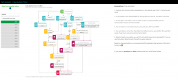
There are multiple buttons you can use with different designs and actionable options. The first one used is a Qlik native button. The second one is a creative usage of Inphinity Flow. You can find more buttons on Qlik Garden, e.g. menubar.
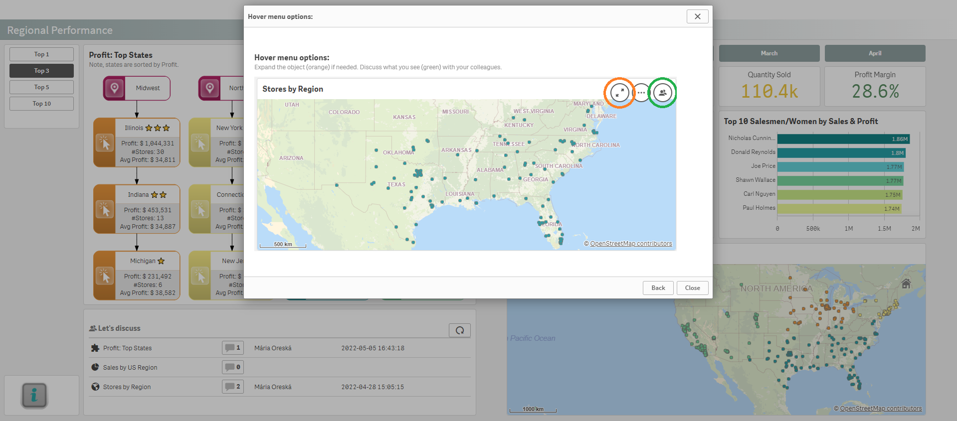
BONUS TIP: Focused Flow
The developer knows how to use a sheet (s)he designed. But is it clear to a user when it’s seen for the first time? Some people let their inside Indiana Jones/Lara Croft take over and click wherever possible to explore the sheet and options there.
But let’s not forget about the rest. Those need a clear explanation of where to click first, what happens, and what are the options. Once the sheet (appliable to technology, as well) becomes familiar to them, they might be the best data analysts in the company. And a simple embedded “documentation” might decide whether or not their potential will be uncovered.

As a person responsible for product development at our company, I’m always thinking about how to make it clear to users what to do. Also, as a former full-time Qlik developer, I’m really glad we came up with a Qlik-native solution to provide this embedded Qlik documentation – by using Inphinity Flow.
Naturally, I’m well aware of the extension we’re developing. If you know other extensions/approaches that might be helpful in this case, please share in the comments so others can explore them, too 😉.
How To Keep Users Focused
If you find this topic interesting and useful, see also:
I hope you find this post useful or at least it makes you think about how to make users’ life easier and engage them 😉. Any feedback, thoughts, other ideas are very welcome!