Want to compare multiple metrics over one axis of dimensions?
This post will help you to understand how you can use a parallel coordinates plot to do that.
Quick Summary
- Many data models consist of multiple facts and measurements. Trying to give insights into multi-variate data is something you might want to do, especially the effects and probable correlations within this multi-variety. A parallel coordinates plot can help you achieve some of these insights.
- This article will show you how this visualization is created and what data it requires to work properly.
- At the end you will be able to download an app with the examples shown.

The above image is one I have referenced many times. I’ll keep doing that, the reason for this is that this to me contains important aspects of how we should think about context.
As for the image above and the parallel coordinates plot, there are a few interesting similarities and ideas to this:
- Both help you to imagine what the relative sizes are to get an idea of the actual comparison
- The chart in the example below shows if there is a relative importance or relationship between one metric over the other. The same is true for how planets orbit the sun and in what order.
- When you choose relevant dimensions to compare against these metrics, you will get insights into the relationship within the results/facts.
Note: Although the image of the planets doesn’t convey meaning about distancing, the main purpose for it is to help you imagine sizes in comparison.
Alright. Lets carry on.
Requirements
- Metrics: 2+
- Dimensions: 1
- Chart Type: Line chart
- Data used: https://github.com/qlik-blog/data-models/tree/master/bike-sales
More information on how to use line charts in Qlik can be found here.
Visualization Example
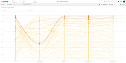
In the interactive view below you can use the drop downs for ‘Occupation’ and ‘Education’ to see for these customer segments how that might change the shape, and thus results, for those properties.

In the visualization above you can see how this visualization works. Every line represents a dimensional value, the line is shown over multiple metrics. The idea here is to show the relative results for these ‘related’ metrics. Using a visualization like this will help people understand the overall influence of metrics and the weight of the dimensions being showed.
For the parallel coordinates chart you will always need to figure out which part-to-whole calculation you need to use the chart in a correct manner. In many cases you will see these charts use a percentage value for that dimensional line to the dimensional total. In other words, when showing the coordinates for revenue, you will have to calculate for each dimensional (segment/line) in the chart what its subtotal is compared to the (overall) total. Simply put it would require you to calculate it like this:
sum(Revenue) / sum(TOTAL Revenue)
In the example above we used the rank() function like we did in the bump chart article. This works as well because this function will also calculate a relative value for each dimensional value.
Chart Creation
Defining your data elements for the chart:
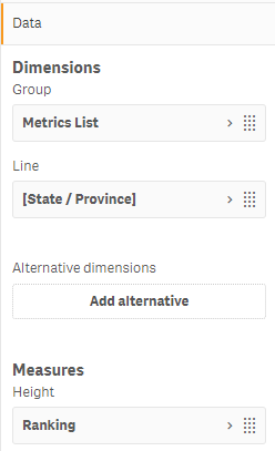
- Create your grouping element (Metrics List)
=ValueList('1. Orders', '2. Avg DealSize', '3. Revenue', '4. Cost of Goods Sold', '5. Gross Margin')
The above expression creates a synthetic list to which we can map our measure outcome expressions.
- Add your dimension field as the line element:
- In this case we used the field ‘[State / Province]’
- Add your measure expression:
pick(match(

ValueList('1. Orders', '2. Avg DealSize', '3. Revenue', '4. Cost of Goods Sold', '5. Gross Margin')

,'1. Orders', '2. Avg DealSize', '3. Revenue', '4. Cost of Goods Sold', '5. Gross Margin'

)

, rank(count(distinct SalesOrderID), 4)

, rank(sum(SalesAmount) / count(distinct SalesOrderID), 4)

, rank(sum(SalesAmount), 4)

, rank(sum(CostAmount), 4)

, rank(sum(SalesAmount) - sum(CostAmount), 4)

) * -1
The above expression uses a combination of the pick() and match() function to map the values of the valuelist() function to the list we created in our grouping dimension. If you look at the expression the logic for the first expression comes from the ‘rank(count(distinct SalesOrderID, 4))’ expression, this expression is the first in the defined list from which the pick() function will map this to the value for ‘1. Orders’.
If you want more information on these functions you can look them up online in the Qlik Help Manual.
Important: In the expression above you can see the addition of: * -1. We do this to fool Qlik Sense in the sorting of the ranking. The default behavior for chart is to sort the highest values on top of the chart. Because we want the chart to sort in a descending manner we can use this little work around. The last thing you need to show the labels on the axis as positive integers is to adjust the formatting of the measure expression.
You can do this under Data > Open the measure tab > Set number formatting to ‘Custom’ and then define it with the value = 0;0

Designing your chart:
The following steps will help you to design the chart to get it looking like the live example above.
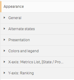
- Under the ‘Presentation’ tab we will need the following settings:
- Line
- Horizontal
- Scrollbar > ‘None’
- Scroll alignment > ‘Start’
- Missing Values > ‘Show as connections’
- Activate the checkbox for ‘Show data points’
- Grid line spacing > Custom > Narrow
- Under the ‘Colors and legend’ tab we need the following settings:
- Colors > Custom > By Expression, the use the expression:
num((sum(SalesAmount) - sum(CostAmount)) / sum(total{1} aggr((sum({1}SalesAmount) - sum({1}CostAmount)), [State / Province])), '0%')
This expression calculates the relative outcome for every dimension based on the ‘Profit % Measure’. This means every line, for every State will be colored according to the outcome of this metric. The more intense the color for a line, the better the profit margin is for that state.
We do this so it is easy to see how these state profiles show outcomes for all metrics in comparison to the bottom line results. What we are after with this is to create a visual cue for how the overall performance of metrics kind of correlates with profit.
- Lastly you might want to set the axis settings to show ‘Labels only’.

After doing all of the above steps associated with the section ‘Chart Creation’ you now have created your own version of a parallel coordinates plot. Boom!
Article Resources
Some of you might also only be interested in the example data and app that come with this article.
Here are some links for you to grab what you need:
(Coming soon)
If you have any questions or ideas, please feel free to use the comments or reach out to one of us!
2 Comments
Comments are closed.
Very nice Patrick!
I’ll definitely try this out.
Thanks!
just a gentle touch to your expression
pick(rowno()
, rank(count(distinct SalesOrderID), 4)
, rank(sum(SalesAmount) / count(distinct SalesOrderID), 4)
, rank(sum(SalesAmount), 4)
, rank(sum(CostAmount), 4)
, rank(sum(SalesAmount) – sum(CostAmount), 4)
) * -1