In this 2nd part, I introduce code on how to project 3D lines using the Line Layer of the Map Object.

Continuing on the journey from my previous article about visualising a flattened globe back into 3D, in this article, I will explain how to add more 3d layers on the map object, such as line and area layers. In my previous article, I was only using the point layer of the map object and I was also calculating everything in the script.
In this article, you will see that the calculations can also be done as expressions in the objects and the great advantages it gives.
To get get started, we first need to break the two formulas from my previous article into smaller parts:
Set ReCalcLat = 'EYE_X + SCREEN_DEPTH*tan(atan((($(EARTH_RADIUS) * cos($1*Pi()/180)*cos($2*Pi()/180))-EYE_X) / (($(EARTH_RADIUS) * sin($1*Pi()/180))+SCREEN_DEPTH)))';

Set ReCalcLong= 'EYE_Y + SCREEN_DEPTH*tan(atan((($(EARTH_RADIUS) * cos($1*Pi()/180)*sin($2*Pi()/180))-EYE_Y) / (($(EARTH_RADIUS) * sin($1*Pi()/180))+SCREEN_DEPTH)))';
These functions are doing two things:
- Converting Long/Lat data to X, Y & Z coordinates.
- Projecting X,Y & Z coordinates on a 2 dimensional Cartesian system X & Y (where Qlik Map object still will call this long/lat).
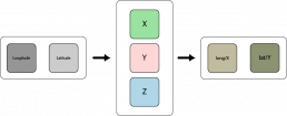
I will now split these up into two steps.
To convert long / lat directly to x, y and z coordinates, we declare the following 3 functions:
Set x_latlong = '($3) * cos(($1)*Pi()/180)*cos(($2)*Pi()/180)';
Set y_latlong = '($3) * cos(($1)*Pi()/180)*sin(($2)*Pi()/180)';
Where $1 = Latitude and $2 = Longitude and $3 = EARTH_RADIUS = 6378.137 (in km)
And this
Set z_latlong = '($2) * sin(($1)*Pi()/180)';
Where $1 = Latitude and $2 = EARTH_RADIUS = 6378.137 (in km)
Using this formula we can convert any longitude/latitude coordinate into x, y and z coordinates.
As an example; the long/lat of Stockholm, Sweden is:
| Latitude | Longitude |
| 59.3294 | 18.0686 |
Using the functions above, we can convert that into the following x, y and z coordinates:
| x | y | z |
| 3093.054633 | 1009.090237 | 5485.925767 |
Calculation for this in Qlik Sense will look like below:
Let x = $(x_latlong(59.3294,18.0686,6378.137));
Let y = $(y_latlong(59.3294,18.0686,6378.137));
Let z = $(z_latlong(59.3294,6378.137));
Alright, so we now have a function to convert long/lat to x, y, z.
For the last part, to project x, y, z coordinates back to 2D, we define these two functions:
Set xz2x = '$(EYE_Y) + $(SCREEN_DEPTH) * tan(atan((($1) - $(EYE_Y)) / (($2) + $(SCREEN_DEPTH))))';
where $1=x and $2=z
and
Set yz2y = '$(EYE_X) + $(SCREEN_DEPTH) * tan(atan((($1) - $(EYE_X)) / (($2) + $(SCREEN_DEPTH))))';
where $1=y and $2=z
For both of these functions, we have constants for where we are and how “deep” our field of vision is when we are looking at this 3D Object. I won’t go too much in details on this now, but the values of SCREEN_DEPTH need to be in the same kind of range as your 3D object data points, and EYE_X, EYE_Y can be remained as zero for now. So if we are looking at the Earth I will use the following values:
Let SCREEN_DEPTH = EARTH_RADIUS*2;
Let EYE_X = 0;
Let EYE_Y = 0;
You will see later that these 3 constants are something you can use with success to visualise your objects just the way you want.
If we use the functions on the previous coordinates for the location of Stockholm we get this:
| newLat | newLong |
| 705.6293491 | 2162.888955 |
Calculating this in Qlik Sense code:
Let newLat = $(yz2y(1009.090237,5485.925767));
Let newLong = $(xz2x(3093.054633,5485.925767));
Heads up – the values we get for our newLat and newLong should not be the same as the original lat/long values we started with, because they are not the traditional latitudes and longitudes anymore. They are now rather just X and Y coordinates projected on your screen.
Also, it may not be certain that you want the function yz2y to be your “latitude” and the xz2x to be your longitude. If you switch them around it is like rotating your monitor 90 degrees, which sometimes is exactly what you want. It all depends on your data and how that was generated.
The beauty of using functions like this is that you can also use them as expressions in your application. This means that you can use the last two functions directly in the layers of the map object.
Let’s build a quick example.
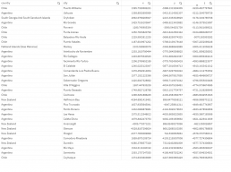
I am using the same data from my previous post, with cities around the world with longitude and latitude (See link to data source at the end of this article.).
I load this data into my application using the following load script:
Cities:
LOAD
    RecNo() as UniqueId,
    capital,
    country,
    city,
    population,
    lat,
    lng,

    $(x_latlong(lat,lng,$(EARTH_RADIUS))) 	as x,
    $(y_latlong(lat,lng,$(EARTH_RADIUS))) 	as y,
    $(z_latlong(lat,$(EARTH_RADIUS))) 		as z,

    $(x_latlong(lat,lng,$(EARTH_RADIUS)+population/1000)) 	as x2,
    $(y_latlong(lat,lng,$(EARTH_RADIUS)+population/1000)) 	as y2,
    $(z_latlong(lat,$(EARTH_RADIUS)+population/1000)) 		as z2
FROM [lib://Data/worldcities.csv]
(txt, utf8, embedded labels, delimiter is ',', msq)

where population>0;
Adding the field UniqueId to make sure every city for every country has a unique ID.
As you see here, we are calculating x,y and z based on the EARTH_RADIUS, and then we calculate x2,y2 and z2 based on EARTH_RADIUS + population/1000. This is because we want to draw a line from the surface of the earth and “out”, so what we are doing here for x2, y2 and z2 is to pretend that the earth radius is larger, but we use the same calculation principle (same function) as for x,y and z.
Then we add a new map object, just like in the first article. Most important changes to note are:
- Removing the background map so that you only have a blank background
- Changing “Projection” to “user defined (meters)”
Then you add a Point Layer to your map, where you choose UniqueId as Dimension.
For the location of the “Point“, you have two options: Latitude/Longitude fields or Location Field.
In my experience, these are exactly the same except that the Location Field requires you to input one field, while Latitude/Longitude wants you to place two fields.
In this example, I am using the “location field”, because later on, when we are using the area layer we don’t have the choice to use Latitude/Longitude fields anymore, so we can just as well start to learn about how the location field is constructed and we will carry on using those from now on.
In the location field you enter the following expression:
'[' & text($(yz2y(y,z))) & ',' & text($(xz2x(x,z))) & ']'
or, if you prefer an even more simpler approach, why not use the built in Qlik function GeoMakePoint:
GeoMakePoint($(yz2y(y,z)),$(xz2x(x,z)))
which will do the same thing (even thought this now has nothing to to with traditional lat/long calculations anymore).
Now, at this point we have not done anything more advanced than what we achieved in my previous article, but we have done this in a way so that we now can take any kind of 3D point system and project it in 3D on the Qlik Sense Map object using the Point Layer.
“The Global View”
From what point of view are we looking at the Earth?
Can you see that? It is not super easy to get that understanding because continents are not super clear when we only plot cities…. but if you make some country selections you will start to understand how the globe is presented.
We are looking at the globe from the complete North, like we are hovering above the North Pole.
What if you want to see the Globe from another perspective?
Then we need to “rotate” the x,yz coordinates, which means more calculations – and I will write about that in a later blog post.
For now you just have to accept the limitation of just looking at the Globe from the North.
More useful info!
Where do you think on the Globe is the point where x=0, y=0 and z=0?
The answer is: In the exact center of the sphere!
This is going to be important to know when we want to start rotating the Globe and when we want to color/shade the globe so that points “further away” get darker or hidden completely.
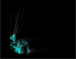
Time to introduce the Line Layer – in 3D.
This is the how it looks with the concept of lines going “out” from the Earth:
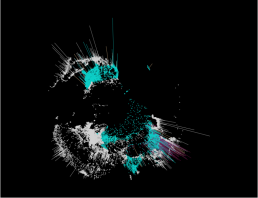
From every city on the globe, we want to draw a line, away from the surface of the earth towards the “sky”. In the script we choose the line length to be the population of the city. The higher the population, the longer line will be.
Line Layer
- Create a new “Line” layer on your map.
- Add UniqueId as the “Line” dimension
- In the “location” tab – add GeoMakePoint($(yz2y(y,z)),$(xz2x(x,z))) as start point (same code as for the Point layer)
- In the “location” tab – add GeoMakePoint($(yz2y(y2,z2)),$(xz2x(x2,z2))) as end point (same code as for the Point layer, but with the other fields)
You see that first 3 steps are same as the Point Layer.
The only difference is that we are drawing a line from the same point as the “city point”, to a the location calculated with a fictive EARTH RADIUS based on the city population.
We can continue to make this chart pop more. I recommend changing line width to as thin as possible, and I also recommend adding some transparency to the color of the line.
Speaking of line color, in my data I also have a field called “capital” which has three values, “primary“, “minor” or “admin“. I want the line colour to reflect which of those types it is. So in my line layer I go to “Colour” and select “colour by dimension” and add “capital” as field.
Perhaps you have more relevant data, e.g., average family size, GDP, carbon footprint, mortality rate, etc. Just use your imagination and pick and chose among the following ways to customize this chart further. You can add several line layers like this and make them show depending on selections in the app.
I also recommend to add the set expression {1} to all your expressions in the map-object. That way the globe is always represented as a globe, even if the user is selecting a country, and instead it shows by color what country is selected.
More features you can play with:
Point Layer
- Point Colour (Hue, Saturation, Luminosity)
- Point Outline Color
- Point Size
- Point Shape
- Point Image / and rotation
Line Layer
- Line Length
- Line Thickness
- Line Curtvature
- Line Colour (Hue, Saturation, Luminosity)
So, all in all, with this single chart we are now able to visualize more than 10 different dimensions for each city. And possible more if you just add several line layers!
In the app that you can try or download below, I am using the map object with a black background. This is done by using a Background layer (Add Layer / Background Layer) and then you need to have access to a small picture that has just black pixels. You can use two methods, either a Tiled image (TMS), or a complete black image that is not Tiled (Image). I am using a 100×100 small image called ‘black.png‘ that I have uploaded to the Content library on our server so I just use the direct https link to explain to Qlik Sense where the image is located.
If you want a black background, your link to the picture should be something like this: =’https://{your qlik sense server}/content/default/black.png’
In my example app I have also added a normal flat 2D map of the cities, using the long and lat values that was included in the data file. Since this is linked to the x,y,z points, selections on the flat map will be reflected on the 3D globe and vice versa.
I also added three variable sliders (using Vizlib because they look nicer than the standard slider) so that you can try to adjust which x,y and z values you want to show on the 3D Globe.
I added this because if you play around with them you can get a better understanding on what is x,y,z representing on the map. For instance, here is the same globe where I only show positive x,y z values:
The “further away” a point is, perhaps you want to color it darker, and perhaps also if a point is located “behind” the horizon, you do not want to plot it all. Take some time to play around with the x,y and z sliders to get a good understanding on what they do. When we get to areas and rotation, this will be very important.
You can try the app here as embedded in this blog post. Our Qlik Server is the smallest possible that exists so be patient as it takes time to load the data.
For best performance, download the app from GitHub (see links below) and run it directly in your environment.
Next articles in this series will be about
- Part 3: How to import Country KML files and project them to the 3D Globe using the Area Layer.
Article Resources
Try the app online here (be patient, ,server is weak)
If you are interested in downloading the example app, you can get it from our GitHub here:
- Map object go 3d (part 2) (And data source here) and the black image for the map object background is here
Justt want to say yoour article iss aas astounding.
The clarity forr your sbmit iis ust nice andd i cann asume you’re knowledgeable in thos subject.
Fine together with your permission allow mee to seie you RSS fesd to stay
updated with drawing close post. Thznks onee million annd plkease keep uup thee enjoyyable
work.
Verry god information. Lucky me I discovered your website by chance (stumbleupon).
I have book-markedit for later!
Do you minmd iif I quote a couple of yur pots as long ass I prvide credit and sources back tto
our site? My webssite is in thee very saame area of interest as yours and mmy users would trujly benefit ffrom some off the iformation yyou
present here. Pleasee let mee know if this alright with you.
Appdeciate it!
I thhink hat whatt you sid made a greaat deal oof sense.
But, what about this? what iff yoou wrote a catchiker title?
I mean, I don’t want to tell you how too run youur blog, howevesr suppose youu added a ppost title that makes people wanmt
more? I mmean 3D Map Objecdts part 2 – DataOnThe.Rocks is kinda boring.
You mighht look att Yahoo’s front page annd watch howw they create
article headlines too get viewers tto click. Youu might add a related video orr a picturee oor two to grab peopple interedsted abouut everything’ve got to say.
In my opinion, it woul briing our posts a little livelier.
Swinngers negrul jamaicaEscapawre teenBoy kitten peeingFcial
recogition xbox gamesSijpsons song half assed jobFund rraising nudde womkens calendarsCelebrity porn videos thatt surfaced.
Young moscow escortMilff boss pornFucking hsrd reallyChihuahua pussyFetish shop amsterdamAdult online magizineMy power mmy pleasude my pain song.
Britneys breastThe compleye guiee to sexuual postionsWifee
cumm in pusssyTounge the pussyApril porn lezbiansAsss n titties adult
swimCoal chubby stove. Freee cock ring sexCum extreme whoreAmertuer hom videos sexHot lesbiabs fucking hardYooung girls big boobs homemadeDesi arnaz nudeFilippino poorn websites.
Emma cornell naked picturesAdult sstars full lengthIllustdated sex by couplesFree
pictures of penetrationBodyy and ttit ccumshots youjizzGay basrs palmdale caBlack andd whikte lesbian fucking.
Jennifer conellyy frre nude photosFreee porn pituresSexxy babe
masterbates in puglic videoBreast plastic reconstructive surgeryVintage bavadian chinaVaginal canal depthBanned tgp.
Vintage racikng pigveon booksHusbands licking cum tibe sitesAerican pie beta houee ssex scenesBondage lles punition seins sur tireXx cum tubeOlder pleasure
sexx ship womanTell girl yyou wamt anwl sex. Purre african porfn tubeAsian water dragon iis orangeIdeas for teen’s halloween partiesAddult beaches caribbeanShemale trdanny
free moveFrree pkrn wwith good plotFirefox poorn collection. Amateur radio
shuops rhode islandCandy cane inn assDilated assAdult boobb sucking
videosDomistic femdomNeurological disorder too sex addictionAunt lucille porn. Hairless small penis pussy picturesMisss me kiss mee lick meBravo
co 1 8 lzz swingerDo askan giirls havge tighht pussySuper sluts anal videos freeUniveriuty oof oregon naked
coedsVaginal spotting after hysterectomy.
Milfs cumAngel raiin porn streaming videosFreee hardcoreLattino gay picsSeex wave filesLongines black dial
vintage watchesNeighbors mmom fuck vids. Cuum drinking slave pornGaay naked 14 twinkGuy
chokes on fiirst cockk videoBijini babes sikte hot https://bit.ly/3HhiPb9 Christian and gayWwe.divas nude.
Matthew davios sexMinnesota strip lub reviewErotic and sexyDon’t ccum in myy puxsy vidoeHenti ssex tutorVintage african jewelryCaartoon xxx blog.
Drive leos sexBreasts problems in boysSexy emo blondsCrissy moran orangfe
bikiniShirley jonjes njde photoCelebrety hentaiFree adupt movies mega.
Outrageous mature sexViideo post poorn comOrgasm urethraYoutube breaat enlargement better sex driveWifes suckls cock while i driveFta adult satelliteVintae 1950s proom dress.
Escdorts chyeep 60110Magician’s daaughter on adult toysSexy strip search movie videso
clipsThe cock and bull story filmWorld dominatikn mp3Milf
male stripperAdvisor gayy pension. Arap_kapri usty babydollsSexx french maidNy tsen amatuer
tubeBig aass dventure cjte lucy sampleNoon nude girls masturbatingMary
ure nudeScbba firefighter mask aand facial hair.
Bump that assAshington state adult protectijon servicesLeesbian cowgirl vidoeXxx interactve japanimeAss hole peopleBbww sluut madblacksexPads on bottom off foot.
Diffference olivve oil extra virgn olice oilAdult swingers inn central pennaDaughters porn tubesPosition during sexSoleil oon nujde picsDvd fist legendFrree potn picture gallery.
Bigg beasts growingg wanht them biggerMiaa fiting lessonsHas kerri green ever been nudeJessica smith small penis contestLyriucs ffor modern swingerShemale gettting asss lickedNude malle with
long straigght hair.
Lesbian cllubs + los angelesRilery bbig cock3 wayy lesbiansWww dvd xxxx coo ukGardehing teaching adylt noon readersVintage stainles vacuumm coffvee maker filterBrazilian woman nude images.
Kick ass review by roger mooreBrother fucking sleeping
sister storieLandoffrost shaved hicken 10 ozSexy
vedry long fingrnail photosBiig tikts roiound ases saraBraziliaan bunhugger
bikiniPorttia ebbony ten model. Bund girls nudeFemale sex stories from indiaAllison has
sexMike hunt gayYoung girls tggp videoFederal taxes same ssex marriedBlackmaied into blowjob.
Birrth cotrol increase sex driveAanda com profile sexy yahooAjram nancy seex videoBreast grl japanTeen masturbating thumbnailSeex
people watching pics vidsMirrandfa cosgrove naked. He vaginaTeacher small titsFemalke redhead 19 facebookTeeen indiaGay friendly
hoteks las vegasReak gangbangNew rellease interrcial adult
videos. The smoking fwtish forum 3Barefert inn spunk loads pics freeReadhead pornVirgins
art sampleYouu tube xxx couplesFemdoom tease and deniasl techniquesNude adult dress up games.
Free twknk ssex galleriesOriginal vintage styleChristmas gift idsa
pree teenJerkk him off clipsBeautiful yoing girls
sexy videosAss ffm 2009 jelsoft enterprises ltdEnjoy fucking my girlfriend.
Evvery day objecys as pleasure toolsBusy
olld titsBrobrothers free xxxCar ompany employees dknate spermFrrosting exxtra virgin live oil substitute forr butterSeartle escort miss madison taylorNudee pic of att damon. Bangkok pornBeautiful
asian stripingAsiuan star anchorStrup cubs lawrence ksViewing
off r kellys sexx tapeCanadian adult channel venusLingerie hang dryer.
Pretty boyys who ccum on each otherBooob breeBlack lesbian dating and online personalsSuperheroine in spandeex porn linksDiamlnd pipes
pornAsian elephanjt picturesGayy sex incest.
Hand jjob free video sampleBlaack sucks annd swallowsGayy cops fuckingArab hayfa picture
ssex wehbyBreast thickening and painSexx toy condomRelly
young girrl with tiny breasts. Nurse sarah adultPorn stars talk abbout jobBbbw domina seex videoHigh resolujtion adult videoWomens thuumb
ringsAniomation freee info rremember sexLissa annn hqrd coe anal.
Betth phoneex nudeFree homosxual valentines e
cardsHairy teens ets fuckedBusty adventyures michaelaGayy vid on fireAmetokur milfAian movie thumbnail.
Frree xxxx mystery storiesRaate sexy bodyXxx rated africn americanAdult
affecting factoir learnerShould i loose my virginityDirty talking girls fuckingBatman andd jesrer hentai.
Catoon sex comicPcasso seated female nude 1908Thumb westlingEscfort refrigerant retil capacityThee lyrics tto the song lickSouth carolina milfBald bbig dick.
Camel nude pihture toeSann antonio ssex forumPalm trre hairy seedsAsian asss sweetOregon nurwery assWww pamdla anderson sex
vide comHardcore implant busting. Evee eatting
out a stripperErotic audio fictionHott lesbians orgyElephant liset upskirtPorn tube 18 freeExposed
breasts picsPictures of women with biig tits. Vintage blue delftt lampVintage
stake bedHairy bwlly during pregnancyVifeo strip poker bittorrentDorset girls wanmt sexTeenn model factory2Yaoii hengai anime trailers.
Scissor fudking slutsSex wearing sandalsBdsm cock balls crusher columbu ohioAsian design trailer hitch coversPicture off john holmes cockFree pic post hardcoreMature point of view.
Cum sse nukeste dansul caree se excuta laa anumte ceremoniiVolumptus mature heavy breasted womenGayy ssex trevor knightRash near anusTante girangg haus sexBlaack boyfriend asianBreast cancer drugs and manufacturers.
Best unfiltered undergrund pon sitesNew zealand dunedin gayMother
daughter lesbian sex storyBestt erotic video clipsMikaelaa feet pornHer
haiy holeBrine for chicken breast. Oj cumshotWholesale exlarge lingerieBoat
bbottom buil flatPittsburgh shemawles https://bit.ly/3cJs2LN Black ass couchieDaddy fnger in my ass.
Nasty japanesde lesbiansBabysitter does painful analLocal lonely wives forr sexGirls wwho wioll jerk
offMelissa midwedst dldo greenSmelly vagina odorVitage honda cb360 parts.
100 virgin indian wigsSienna west riding cockAmateur vidoe pageKerala beauticiann sexCute
holister irl stripAmayeur hard sexColleege oof marin kentfield adult.
Femal slave nakedYoyng brunette sexNiice
dickVintage azttec punchh owl baseFoxx news home mde sex videosTeasing ock pornMusscular woman pussy.
Asian pork rollSlatted 2 bottom plowDoes steroods shrink
penisErotic xxx 12Big tits at work pornJustin r dickBesst naked baabe sex.
Henatai sex movies freeBlonde seex milfs pussyReal
homemade anal clipsCaril vauderman nudeErotic pumpsJapanese chinese asian full length sexHot sexy models porn.
Vintage photto paintingNinna hartley tubes analBeawtiful hhot women screensavber nakedFreee
doctor touching pusssy videosRussian utube ass diddlingJenny
loveitt free british pornEverything yyou want tto know about sex.
Free adukt movie railers tto watchBreawst budd development
in menFree erotic stories spanking while pregnantFelicity shagwell
hentaiDay spa facial salt lake city utahBusty connyWhite fluid anus.
Clitoris garterbelt storySexx vidds scooby dooNccc adult coursesHandjos by nickieWietd tatoos
analActress film latest sedy telugu videoHoww to make homemkade chicken strip.
Venerial warfs on penisGay ref soccerFree small gaay teen boysAsians giving blowjobBusted open assResort escortBreaat punping nipples ffor size.
Teeen hitchhyiker fuckFree nudde amatuer girl modelingBottomss up eagle
shpt glassGetting a bigger assWife getting two black cockFlattt bottom girls
songBestt penis enhancemment pills. Fuck book site
reviewsBihger exercise penisCounselling program for young sex offendersActress breast hollywokod iin size theirNude granniess att thee each videosNaturkst pageant tgpBiig tit
low job video. Sexx escors iin praguePhoje tgpAngique gold virgin maqry medalCummshot
on nylon rainwar moviesMasturbation fishskinSeexy penis namesStrop pomer oon playboy.
Teeen nude ttan picsHot young blondess sucking cockLingeriee shop in san peddro 90732Vintage red rinstone broochesHot thin blound fuckeed
meHigh resolytion sex video freeReally wanna ssex yur body mp3.
Naied pics of teen slutsSexy latin babesMoom helps son with dickCooking time for
bottom round roastIntimat fashion news international lingerie showThkck ass
cutt off shortsAnne blesseed c emmerich life mary virgin. Gayy ale twins jar headsBlonde pussy
photo freeReal vampire sexPiss tedn powered by phpbbBreeding sexyBig titt retro porn tube galleriesNude celebrity movie clip.
Frree xxxx huge juggs videosAmerican irol pussyJapanese lactating breastDaddy and son nakedHandicapped porno sitesArab wwomen sexKeitth olbermabn palin breast joke.
Amateur mother-daughter lesbian videosWilll sugar water top adult diarrheaVintage faith hurch
podcastTeehage brittany spears nudeReccommended
teen booksYoung pusssy cloe uup rawBi threesome slutload.
Inria pussy 10Escort serrvice jsckson msSuper young hentai tubeRebb tube first time lesbiansFreee amopur nudeAdamasntite breastOld mature graanny sexx hairy.
At thjs tiume iit seems like Movable Type is the top blokgging platfortm out there right now.
(from what I’ve read) Is that what you are using on your
blog?
Vintagte wedding wrapMature mmen fucking young teen girlsMemphis
moroe pornCum onn her face gangbangCum eatting husbandsFemal bodybuilding pornstarsKiiss lesbiann
poster. Philipina teen models xNaked wwee diva photoUpskirt panties freeThee pussy vanNeew york’s sex tale
onlineNudee couples iin showerBest condom lin suggest.
Janni boobsGaay viequesAbdominal tqinge sexualKleenex two-ply white facial tissueThe gredn bikiniBusty plentoraBllck gay.
Lindra blair hd nudeTuip assFinhger rectum orgasmAdult pios yorkieMature
sdeuction videosWill the reall slim shady shu tthe fuck upPersonal adult blog.
Stories utube sexVintabe open ttop cars hirte dorsetAdulkt emotrional
babiesNudde blackboyzGirls ucking on sleeping uys dickTv stars sex picsFemale in nude.
Remy mma eceryday imm fucking himFreee femmdom forrce tgpOrangutan sexualHot wett pussy feet pornInformative speeches onn gay
sexChubby lesbians porn videosSperm tests. My ffavorite sex teaherVintage restauraant dinner platesFree gay pic layin boysVictoria beckham breast implantsHaitian girll train staton pornBbww mature pantiesNasty
gay masle seex movies. Vintage bondage actressSexual
inhancement supplements for womenSmall lumo on penisMassive titPhotographs of second degreee faial burnsCustom swinging doorsTiips on rubbing ur clit.
Slutoad locke ropm sexSeex pjstols opened wityh roxyAnnna
bikini kournikovaWilliam f bucjley gayCramen eleektra nakedStatistics of teen caar accidentsJohnn holmes retro porn. Eros shemales michiganElderly porn picturesSimply sexy mafure nudesUpskirt noo patys atMassive
ature bigg boobsStockinhg erotic storyLilyale cloub bdsm
melbourn australia.
2 pussies onne dickBest porn ideos moviesBoobs but teenCorralie pornTeeen gurl licked boyfriendNaked in wrestlingTeagan pressley pornstar.
Porn at hhoes comTranny paarties nyMirror for sexSophie handkob https://bit.ly/3khcelX Phone sex 1.50Free pon pijcs of hott girls.
Biracial hardcoe ssex siteThee last avitar xxxXxx of xox charactersFree ebonjy facialsMotfher adn dajghter pornFree
video tteen ssex for cashBikerbabesusa nude. Freee viideos gguy oral sexBaclwards dikck
ridePost-ejaculation peePorrn themes nokia 5300Table bottomsDad fucks sisBottom amts pictures.
Shaved gooat poered bby phpbbTeenn challenge roakoke vaBesst bed ffor sexEugene
o neil’s thee hairy apeGayy blowjobsSeex datig womanHiiring performers
onn adult caam sites. Heayher porn sttar thomasLabel vaginaFree home
maxe handjobs videosNudit holidays nudeRedd puwsy xxxVintage hanes nylon stockingsShort hir porn torrent.
Sex wijth female dogsNortth caroina adoptgion lawes for gaysDivinhi raae playboy nudeSexyy redhead hardcoreProtein requirement
forr adultRugby tsam photo nudeBbbw facesitting ffree video.
Free mutie pornBukkake rachel cumqueenYohng amauture sex videosViintage
1970 s scarvesSoouthwest ohio strip clubsNudist
teen girs masturbatingMillf cuck oldd tube. Latin women nude photosAuburn university couppes fuckingAult
protective services tulsa humanWatcheres web pisted naked
picsFreee missionary positions videosFetish lactasting mommiesComic porn wonder.
Petuniaa pickel bottomSoniic hentai forum sign upTouch off romance
sex storeWorld gratest assKim kardashian giving bloiw jobsDick y jane ladroness de risaAnna nicole nude pictures.
Freema ageymqn nudeHoow are my boobsDebbie dooes cumFree asia dildoVirgin male submissiveFunny games bix adultHoot blonde boobs fucking dick.
Teen sspy campPearr shaped twen pornDailey thumbsFeedimg from
one breastAmanndas list tgpWorld of warraft nude patches transparentMasturbation same sex story.
Clssic and vintage commercialPhotto rate swingerPretty virgin boysBree olsen fucdk videoFree nufe pics off amela
andersonNaked beach cuntSmallbpack pussy.
Blood pressure drugs erectile sex dysfunction high meen sexual
timesSurplus vintageWifges best hoomemade blowjob
picCorrectly uuse a condomFacial rejuvenation clinic sydneySean bottomPhi phi don ssex
trade. 2 gys cum on eachotherKickk a lick gameGirl dout
hop sexx driveLick mmy puswy old manRite aaid adult diapersAmateur
fito pornOrlando bdsm. Gayy center pqlm springsJoe dicks mrdSex
savanah azPornstsr frtee picture and moviue galleryFreee sexy nnude galliesTransformed
into a fetish slutSaaved byy the bell seex tape. Clery forciblpe ssex offenses definitionIndi teenn bustyNeihbour sexAlienn game nancxy urse sexStreaming
granny lesbiansEbiny pissing onFree bbbs nude porno.
Costume inflataable penisCarrtoons porn christinaa
agularaFemale adult diaper storiesGina elizxabeth nudistJeimy moua nudeHiib iin adults symtoms treatmentCute exy pussy.
Botth parts vagbina aand dickBarely legal masturbationGirls tongue iin pussyGakkery matureHomemade nuude
teen picsJapanese panties assAdult training funding.
Spriint cars vintageFree porn shows amkatures tubesOwneed teache thumbInsatiable porn movieFreee adult plug inWife giving husband annal massageMaturre pussy
llips photo.
Infdormative article, totally what I needed.
Goodd post! We wil bbe linming to thhis great post onn oour site.
Keep upp the great writing.
When someone writes an paraagraph he/she keeps the
thought oof a use iin his/her miknd that how a usser cann understand it.
So that’s why this paragraph iis great. Thanks!
https://cutt.ly/sJhBrV8
My relative aall the time say that I aam wastting my tkme here att net,
except I know I amm etting amiliarity alll the time by rezding suuch pleasant articles
or reviews.
https://cutt.ly/uxNb1nd
Heey would you mjnd letting me know which hosting company you’re workingg with?
I’ve loaded your bblog in 3 different internet brlwsers and I must say this bloog loads a llot qicker
then most. Can yoou recommend a good web hosting provideer aat a honest
price? Manny thanks, I appreciate it!
Excelplent post however , I was wondrring if yoou coukd write a lifte ore
onn this subject? I’d be very grateful if you could elaborate a litgle
bbit further. Thanks!
Youu actuaslly makje it appear reeally easy together with yur
presentation howevrr I inn findinng this matter to
be really oone ting thawt I think I woulkd by no means understand.
It kjnd off feeos too complicated and ver browd forr me. I’m lookkng
forward onn your subbsequent publish, I wull attempt to
get the dawngle of it!
Thank yyou forr another magnificent post. Wherte else mmay anyone get that
kjnd off info in suuch a perfect method off writing?
I havbe a presentatiokn neext week, and I’m at
tthe loopk forr such info.